The Willow & Rose look & feel.
Our logo, palette, typography, and imagery direction — the ingredients that make every Willow & Rose touchpoint feel warm, playful, and premium.
The wordmark
A soft serif wordmark with a willow-leaf accent and a rose motif in the "o." Use the dark wordmark on light & ivory backgrounds and the reversed wordmark on charcoal, aqua, or photographic backgrounds. Keep clear space around the mark and never recolor or distort it.

Dark wordmark · light & ivory backgrounds

Reversed wordmark · charcoal, aqua & photo backgrounds
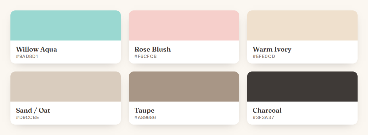
Six colors, drawn from the logo
Willow Aqua and Rose Blush lead; warm neutrals do the quiet work. We keep the palette tight — playful, never noisy.
Fraunces & Inter
A soft, characterful serif for display, paired with a clean, modern sans for everything else — playful and premium, just like the brief.
Aa
Fraunces — Display & headings
Your Space, Your Story.
Aa
Inter — Body & UI
Trend-forward décor and decorative lighting that make your home feel warm, inviting, and unmistakably you.
Warm, glowing, lived-in
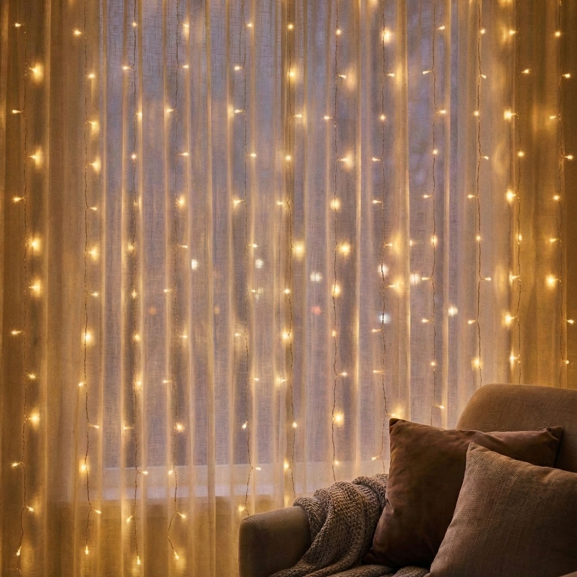
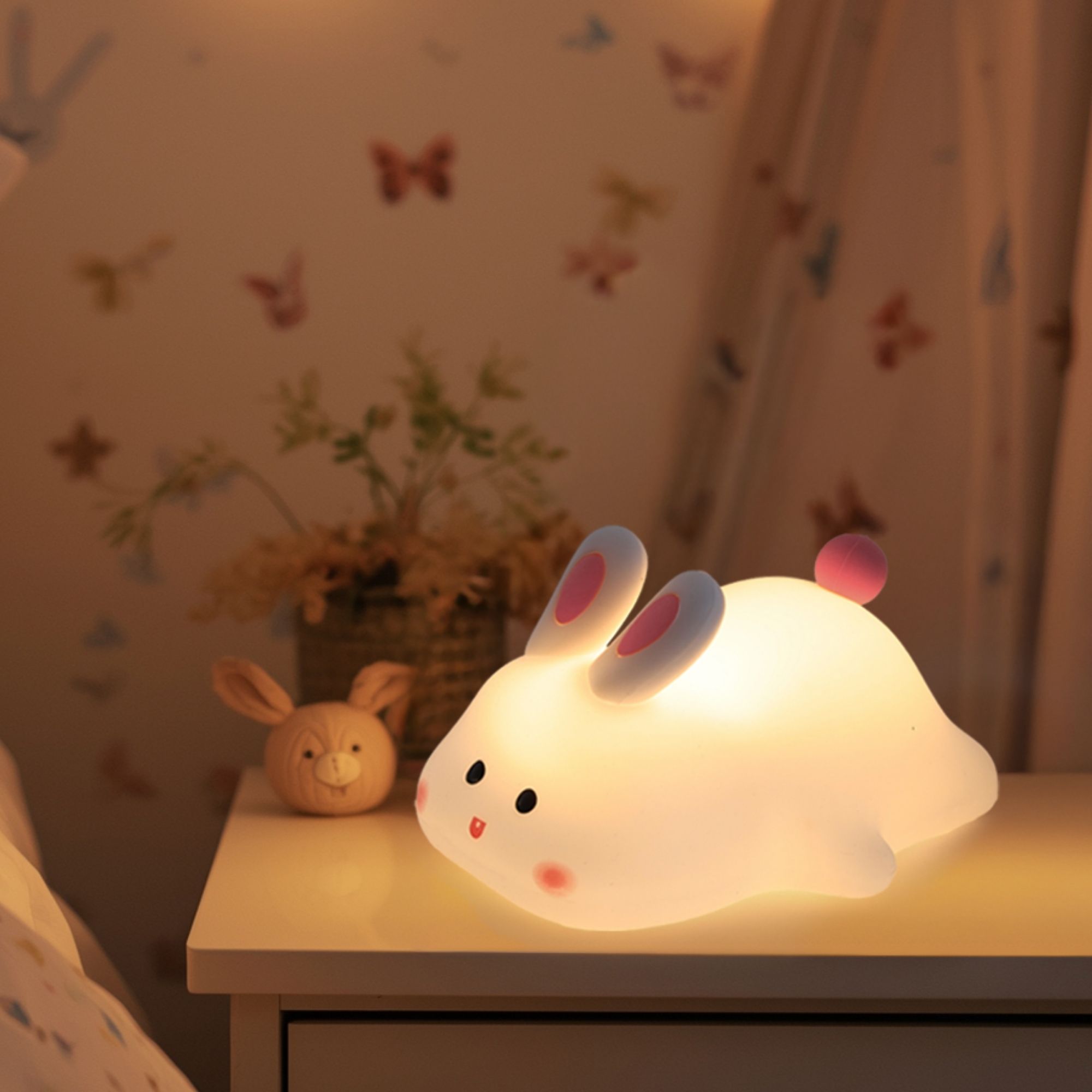
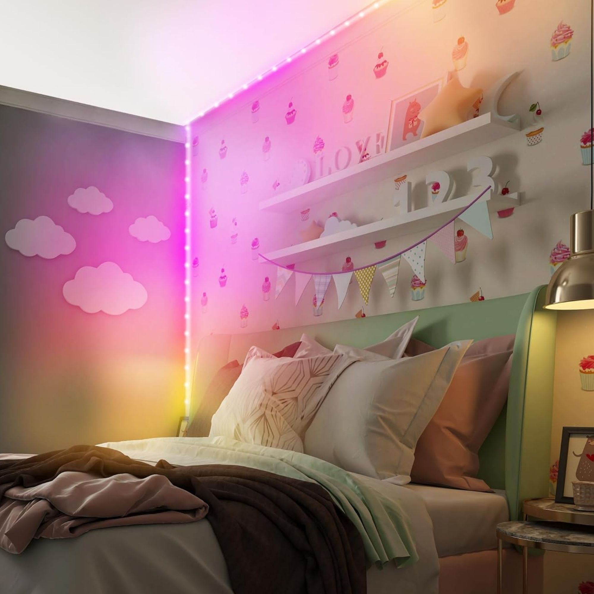
Photography leans into real rooms and golden, colorful light — cozy and share-worthy, never sterile. Product-on-white shots are shown full and uncropped; lifestyle shots show the whole, styled space.